Broken Clouds
Florida - 31.54°C - Broken Clouds
11-09-2024
12-09-2024

Features

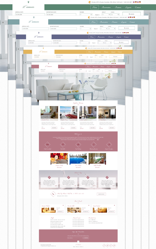
L'amour template supports 5 colors, you can change the colors of your website by selecting your prefered color in the Styles select box. Use the customizer to create your own style, you can easily customize colors, fonts, margins and even more settings of the template.

L'amour Template colors

Module Positions

The following screenshot shows the detail view of L'amour template with list of the module positions used:
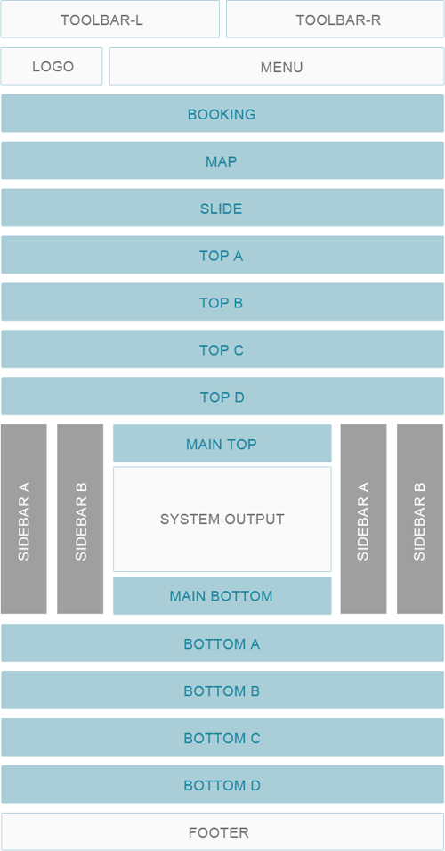
L'amour Module positions

Sidebar Position: Align the sidebar to the left or right.

Select a grid layout for module position (equal, double or stack).

Module Variations

There are 7 stylistic module class suffixes which provide a unique style variation to the module: title1-4 and box1-3. There are also various additional structural suffixes, these affect the layout and metrics of the module.

Using a Suffix: Enter any available suffixes at Extensions → Modules → Module (you want to use) → Advanced tab → Module Class Suffix field. You can compound multiple suffixes together such as: box1 title2.
Typography

Heading

H1 Heading

H2 Heading

H3 Heading

H4 Heading

H5 Heading
H6 Heading
Buttons
Icons
Icon sizes
  • This is the default size.
  • This icon uses the .uk-icon-small class.
  • This icon uses the .uk-icon-medium class.
  • This icon uses the .uk-icon-large class.
Icon button
Blockquote

The <blockquote> element defines a long quotation which also creates a new block by inserting white space before and after the blockquote element.

The <blockquote> element defines a long quotation which also creates a new block by inserting white space before and after the blockquote element.

Spin modifier

Add the .uk-icon-spin class to create animated spinning icons.

  • Spinner icon for loading content ...
  • Refresh icon for refreshing content ...
Progress
55%
55%
55%
55%
Badge

Badge 1 Success 2 Warning 3 Danger 4

Pagination
Message boxes

To indicate an infomation message add the .uk-alert-info class.

To indicate success or a positive message add the .uk-alert-success class.

To indicate a message containing a warning add the .uk-alert-warning class.

To indicate an important message add the .uk-alert-danger class.

Form states
Form styles
Text
text-muted
text-primary
text-success
text-warning
text-danger
a element
em element
strong
code element
del element
ins element
mark element
q inside a q element
abbr element
dfn element
Content Boxes

Box

Lorem ipsum dolor sit amet, consectetur adipisicing elit.

Box primary

Lorem ipsum dolor sit amet, consectetur adipisicing elit.

Box secondary

Lorem ipsum dolor sit amet, consectetur adipisicing elit.
Lists

List line

  • List item 1
  • List item 2
  • List item 3

List striped

  • List item 1
  • List item 2
  • List item 3
Table caption
Table Heading
Table Data
Table Data
Table Data

Title

Lorem ipsum dolor sit amet, consetetur sadipscing elitr.

Title

Lorem ipsum dolor sit amet, consetetur sadipscing elitr.

Best Deals

Special Sunday!

Save up to
25%
Information

Day Spa Offer!

Save up to
$15.00
Information

Summer Holiday!

Save up to
10%
Information

Info

  • Check-in: from 14:00 - Check-out: until 12:00
  • Restaurant, Bar, Breakfast in the room
  • Free! WiFi is available in all areas and is free of charge
  • Free private parking is possible on site (reservation is not needed)
  • Overlooking the River, within a 5-minute walk to Opera House, Park, Shopping Centre...

Contact Details

  • Tel: +1 (800) 22 33 444
  • Fax: +1 (800) 22 33 555
  • Email: emailname@hotelname.com
  • 123 Street Name, City Name

Sign Up Newsletter

Enter your email address to receive news and offers from us